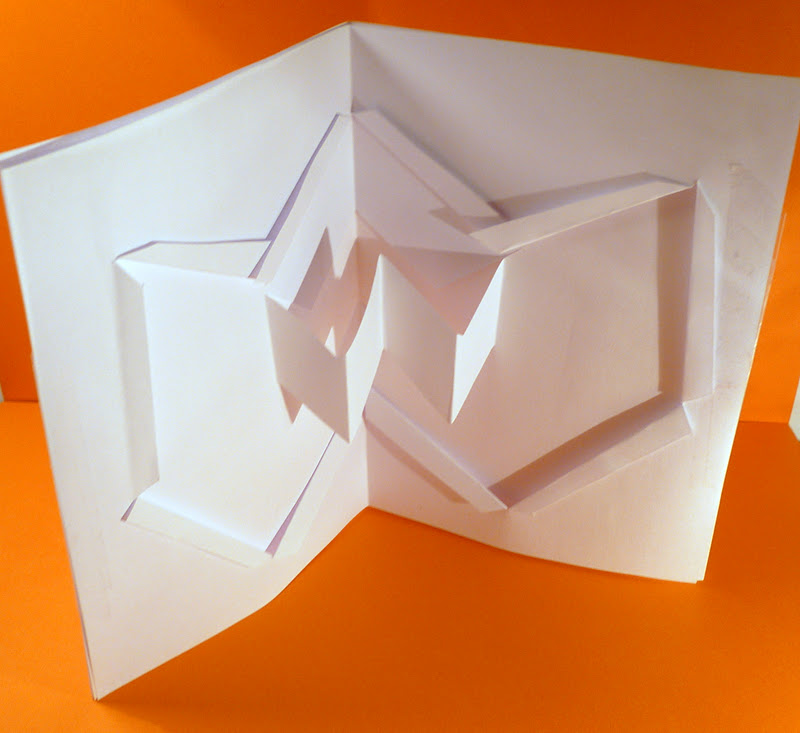
with these layouts i wanted to focus on two things: that the visual kept in sync with my "W" wolverhampton logo (simplicity, strong form ad angle) and that architectural form was represented in the layout (as this was the original inspiration for the rebranded logo). i also used elements that reflect my editorial layouts, the angles and types used, to give an even greater sense of a brand identity.
Showing posts with label re-branding. Show all posts
Wednesday, 11 January 2012
Thursday, 8 December 2011
Wednesday, 23 November 2011
BRANDING IN CONTEXT : MAILER MAQUETTES
With my maquettes, which will eventually be made into a mailer, I wanted to base he design around my "W" logo. I felt the shape had such a strong, yet simple, feel to it, that it could translate into pop-up quite easily and effectively. Below are a selection of some of the more stronger maquettes, that I have coupled with lighting and coloured backgrounds to show where I could take the design next.
Friday, 4 November 2011
2012 OFFICIAL OLYMPICS POSTERS
Continuing on with the "re-branding theme": for each Olympics there is always a strong redesign, to make each one unique and individual to the city that is hosting the event. For London, official posters (representing the Olympic and Paralympic Games) have just been released, all designed by successful artists (such as Bridget Riley, Tracey Emin and many others). It really shows the eclectic range of visuals that can be created and designed from the basis of one starting point (in this instance, the Olympic Games).
Check out the selection of 12 posters here.
(source : guardian.co.uk)
Wednesday, 19 October 2011
ARCHITECTURE RESEARCH
For all three modules I have decided to somehow intertwine research on the architecture of Wolverhampton into the projects (The logo form will be based around the architectural shapes for Branding in Context, that logo will then affect the animation for Applied New Media Design and my problem/solution will be based around the desolation of buildings and the editorial forms will also be affected by building structures in Applied Editorial Design). So here are my images of the types of forms I am basing my ideas/designs around...
Thursday, 13 October 2011
APPLIED NEW MEDIA DESIGN : ANIMATION TESTERS
I had already posted about my "W" logo designs, and it was important while considering my design process that I had to remember the Applied New Media Design module. Considering the fact the animation has to be visually interesting, I wanted to experiment with how I could "fold" up my logo (by creating it physically in paper form) and then begin to translate that to the screen.
BRANDING IN CONTEXT : WOLVERHAMPTON LOGO DESIGNS
Here is a sheet I have selected from my initial degins for my "W" icon, to accompany the type of "Wolverhampton" and a strapline, that together will form my re-branded logo.
The "W" below is the the icon I believe is strongest visually (mainly in its simplicity and I feel it holds the qualities I wanted to incorporate - architectural structure, inspired by the buildings of Wolverhampton). I also feel it will cross over well into the Applied New Media Design module, as I feel the structure of the icon will lend well to an animation (such as being animated to appear as if it is paper unfolding).
Wednesday, 5 October 2011
RE-BRANDING MELBOURNE
I found this video ident from a 2009 campaign where the logo and visual brand of Melbourne was redesigned and re-branded. It feels extremely relevant to the "branding in context" AND "applied new media" modules, incorporating logo/brand design with animated logo details. I believe this video shows a very successful design, feeling sleek, uncluttered and relevant to today's visual landscape. I hope to incorporate the same fundamental values in my own work.
Sunday, 2 October 2011
FIRST POST
So, with this blog I'm hoping to tie together all the research, initial ideas and designs for my semester 1, year 2 modules: Branding In Context, Applied Editorial Design & Applied New Media Design.
The briefs outlined are based on the idea of "re-branding" Wolverhampton, much in the vein of the cities of New York or Barcelona's city re-branding.
I'm hoping that this blog aids me in showing the journey my work will take throughout the design process.
Enjoy :)
The briefs outlined are based on the idea of "re-branding" Wolverhampton, much in the vein of the cities of New York or Barcelona's city re-branding.
I'm hoping that this blog aids me in showing the journey my work will take throughout the design process.
Enjoy :)
Subscribe to:
Posts (Atom)