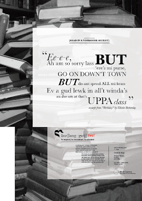
Here are the final designs for my campaign and event posters. I feel after reworking elements within them, they now stand individually, but also are true to the palette and can be associated together. The main points are use of type (Baskerville) and being consistent in alignments and sizes, also use of imagery (as it links together - the black and white photographs).
Showing posts with label poster design. Show all posts
Showing posts with label poster design. Show all posts
Friday, 23 March 2012
Sunday, 4 March 2012
GRAPHIC COMMUNICATION PRINCIPLES : First Digital Mock Ups of Language Posters
These are the first mock ups for my campaign and event posters for the "love [lang-gwij]" campaign. Looking at them, I feel they uphold the brand palette well, but they do appear slightly too similar. Though they should be associated with each other, they should also stand individually as well. I will go away and re work some elements and see if that comes up with any new solutions.
Saturday, 25 February 2012
GRAPHIC COMMUNICATION PRINCIPLES : Final Brand Palette
Here is the design sheet for my brand palette. In it contains all the main focal points any associated design pieces would need, to reflect the brand and keep a strong visual theme running throughout. Obviously, I will be using this to dictate my poster design.
Monday, 20 February 2012
Friday, 17 February 2012
GRAPHIC COMMUNICATION PRINCIPLES : Symbol Design Sheets
The symbol for the brand palette has been part of the design process I've struggled with - to create something original, relevant and interesting in a small, simple mark is a tall order. Here's my design sheets for the process I went through and I think it shows a successful outcome:
GRAPHIC COMMUNICATION PRINCIPLES / STRATEGIES : Potential Background Images
For my brand palette (and also into my microsite design) I am choosing which vintage-style. black & whit ephotograph images to use. I want them to be loosely linked into the campaign (such as the image of the lake is from yorkshire - a dialect I am using the dialect of), but also to be ambiguous enough that they don't put off some audience members.
Wednesday, 8 February 2012
BRANDING IN CONTEXT : A few more poster ideas...
A couple of designs I switched around a little (in arrangement and type...) to see if I could make them any stronger:
Also had another idea about "creativity being in the student's hands" and thought of making a more obvious 'type as image' poster. I think it could be quite effective...
Thursday, 2 February 2012
Wednesday, 1 February 2012
BRANDING IN CONTEXT : Graphic Communication course poster design
In the latest "Branding In Context" module, we are being asked to create a poster that sums up a statement about the "BA [HONS] Graphic Communication" course at Wolverhampton University.
A part of the statement that struck a chord with me was: "reflect[s] industry practice and offers study options in print and screen media that reflect this diversity". The idea of "industry" makes me think of after the course and the careers that hopefully all participating students will go onto. Lots of these careers will lead students to the "big city", such as Manchester, Birmingham or London, or have a wider sense of that idea: the big, wide world. So I thought I'd play on that idea, using the strap-line: "Building Big City Dreams" (I am also potentially thinking of using "Ideas", instead of "Dreams"). I think this helps reflect the idea of students having big dreams for what the course can lead them onto and also offers opportunities to use imagery of buildings in an interesting way:
throughout these I kept my research into Russian constructivism in the back of my mind, such as the Stenberg brothers' work, looking at perspective and very sharp contrasting angles in their posters.
The second set of posters I began playing round with was the idea of the student bringing their own creativity to unlock the potential of the course. Sometimes around the MK building, some rooms or walls feel bare, large expanses of white. Students must be the ones to fill those spaces, therefore: "Fill The Space" or "Fill This Space" can speak volumes, a command for students on the course to take the tools taught to them and use them to be creative and innovative:
Subscribe to:
Posts (Atom)


