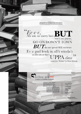
Here are the final designs for my campaign and event posters. I feel after reworking elements within them, they now stand individually, but also are true to the palette and can be associated together. The main points are use of type (Baskerville) and being consistent in alignments and sizes, also use of imagery (as it links together - the black and white photographs).
Friday, 23 March 2012
Monday, 12 March 2012
BRANDING IN CONTEXT : Facilities Viral Video
I have decided to leave the "time lapse" idea, where I wanted to use coloured forms to give the impression of creativity, as I felt it may be too abstract within the time limit of 1 minute. So I'm going ahead with my alternative idea, snippet video clips of each facility used in the Graphics course, that aids the design process. Below are some of the set ups I will hope to film:
Within these sheets I speak about the length of each clip being a few seconds, long enough to get a feel for the use of the facility and then moving onto the next. I want the rapid succession to give the idea of multiple layers going into the course's structure, involving many processes that help create ideas and produce design pieces.
Below I have taken some preliminary shots, to give the idea of how close-up each video clip will be and what sort of angle/subject will be included. Such as:
Using the Macs.
Taking Notes.
Room's facilities (e.g. light switches, tables etc.)
Wednesday, 7 March 2012
BRANDING IN CONTEXT : Facilities Viral Video Ideas
I have begun the stage of developing my ideas and creating initial storyboard visuals. Below I have showcased some ideas about where I could take the video. These include:
1. A series of video snippets showing the varied facilities used within the course (e.g. lights being switched on, printers, Mac computers etc). It could give an overview of the many areas that help with the design process.
or
2. A time lapse/stop motion animation of a person sitting throughout the piece, while behind them a whole wall is filled with shapes and coloured forms depicting the many facilities that are on offer to Graphics students.
I decided to explore the "time lapse" idea, in the sheet below you can see the beginnings of the coloured shapes I'd want to create and have appearing within the video. I also drew out where the person could be positioned to give the most direct message across that what is forming behind them is meant to be their creativity and thoughts being realised.
In the work sheet just above, I spoke about how I wanted the forms that appeared around the person's head to be inspired by some of Lissitzky's work. Bold shapes and a select colour palette, which will reflect creativity in the course and also freedom of expression allowed for ideas.
Sunday, 4 March 2012
GRAPHIC COMMUNICATION PRINCIPLES : First Digital Mock Ups of Language Posters
These are the first mock ups for my campaign and event posters for the "love [lang-gwij]" campaign. Looking at them, I feel they uphold the brand palette well, but they do appear slightly too similar. Though they should be associated with each other, they should also stand individually as well. I will go away and re work some elements and see if that comes up with any new solutions.
Thursday, 1 March 2012
BRANDING IN CONTEXT : Initial Brainstorms - Brand Values
So, in this brief we were able to decide whether we wanted our viral video to promote a journey, the students, employability/alumni, the building or the facilities. I decided to brainstorm those areas, to see what interesting areas could be focused on and used creatively.
I found that facilities was something I wanted to focus more in depth on, as I felt it could allow me to film/photograph multiple areas that are associated with the Graphic Communication course and could be used to promote it within a video.
Subscribe to:
Comments (Atom)


