Monday, 8 October 2012

[DESIGN CULTURE : RSVP MODULE] Trip to Birmingham : Ikon Gallery - Tony Arefin Exibit

The course took a trip to the Ikon Gallery in Birmingham - where an exhibition was on, celebrating the work of Tony Arefin (who sometimes worked under the pseudonym Arefin & Arefin). There were multiple pieces he had created for corporations and branding, but one set of pieces that struck a chord with me - and I felt could relate to the Design Culture 'RSVP' module - was his work for 'Sex Has Consequences' campaign. It featured beautifully lit photographs of people, with a bold, red negative word printed across them. This word makes the viewer involved in the image, obviously associating it with the person in the image - but when it is read with the statement to the side, it is seen to be a deeper message about consequences of having sex.

(Photo : Amy Denton)

As I was looking into this campaign, I stumbled upon this run down of '18 Provocative Pregnancy Campaigns and Posters' - which includes Arefin's work - and it made me think about the important issues design can take into it's hands, to educate and inform. See the list here.


"This doesn't really stink, but the outcomes of your choices can."

Tuesday, 8 May 2012

GRAPHIC COMMUNICATION STRATEGIES : Final Language Viral Stills

So I have finalised my "language" virals and here are stills from each one. The first is based around the idea of a glamourous photoshoot: big, red lips, fur coat, bouncy, blonde hair - lots of posing and pouting! The song playing over the top is "Rude Boy" by Rihanna, known for it's sexy lyrics and sound. After a few quickly edited snaps of the "shoot", it cuts to the girl reciting William Wordsworth's "Daffodils" poem. The word "Poetry" then fades in, as she blows a kiss. The screen then fades to black, with the statement: "Expect the unexpected" fading in. The juxtaposition of a supposed "bimbo", who had been dancing around and blowing kisses, then reciting verse is meant to show the viewer that poetry can be surprising and appeal to a wider audience then once thought.


The second viral also plays on the idea of "expect the unexpected". This time the girl is a stereotypical "goth": black lipstick, black hair, hooded top and lots of devil horns with her fingers. She begins to scream and headbang at the camera, shaking her hair out and act as a mad woman. All the while the song "BYOB" by System of a Down plays over the top, a rock song, which I chose for it's guitar and fast drum-lead pace (linking to the fact she is playing air guitar and banging her feet). Again, after a set of quickly edited shots it cuts to the girl reciting William Wordsworth's poem (kept the same to show continuity and so the videos can be linked together), she then makes the devil horns to the camera as the word "Poetry" fades in, once again. Screen fades to black and the same statement fades in: "expect the unexpected".

Friday, 23 March 2012

GRAPHIC COMMUNICATION PRINCIPLES : Final Language Poster Designs

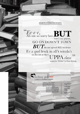
Here are the final designs for my campaign and event posters. I feel after reworking elements within them, they now stand individually, but also are true to the palette and can be associated together. The main points are use of type (Baskerville) and being consistent in alignments and sizes, also use of imagery (as it links together - the black and white photographs). 


Monday, 12 March 2012

BRANDING IN CONTEXT : Facilities Viral Video

I have decided to leave the "time lapse" idea, where I wanted to use coloured forms to give the impression of creativity, as I felt it may be too abstract within the time limit of 1 minute. So I'm going ahead with my alternative idea, snippet video clips of each facility used in the Graphics course, that aids the design process. Below are some of the set ups I will hope to film:


Within these sheets I speak about the length of each clip being a few seconds, long enough to get a feel for the use of the facility and then moving onto the next. I want the rapid succession to give the idea of multiple layers going into the course's structure, involving many processes that help create ideas and produce design pieces.


Below I have taken some preliminary shots, to give the idea of how close-up each video clip will be and what sort of angle/subject will be included. Such as:

Using the Macs.


Taking Notes.


Room's facilities (e.g. light switches, tables etc.)

Wednesday, 7 March 2012

BRANDING IN CONTEXT : Facilities Viral Video Ideas

I have begun the stage of developing my ideas and creating initial storyboard visuals. Below I have showcased some ideas about where I could take the video. These include:

1. A series of video snippets showing the varied facilities used within the course (e.g. lights being switched on, printers, Mac computers etc). It could give an overview of the many areas that help with the design process.

or

2. A time lapse/stop motion animation of a person sitting throughout the piece, while behind them a whole wall is filled with shapes and coloured forms depicting the many facilities that are on offer to Graphics students.


I decided to explore the "time lapse" idea, in the sheet below you can see the beginnings of the coloured shapes I'd want to create and have appearing within the video. I also drew out where the person could be positioned to give the most direct message across that what is forming behind them is meant to be their creativity and thoughts being realised.


In the work sheet just above, I spoke about how I wanted the forms that appeared around the person's head to be inspired by some of Lissitzky's work. Bold shapes and a select colour palette, which will reflect creativity in the course and also freedom of expression allowed for ideas.

Sunday, 4 March 2012

GRAPHIC COMMUNICATION PRINCIPLES : First Digital Mock Ups of Language Posters

These are the first mock ups for my campaign and event posters for the "love [lang-gwij]" campaign. Looking at them, I feel they uphold the brand palette well, but they do appear slightly too similar. Though they should be associated with each other, they should also stand individually as well. I will go away and re work some elements and see if that comes up with any new solutions.


Thursday, 1 March 2012

BRANDING IN CONTEXT : Initial Brainstorms - Brand Values

So, in this brief we were able to decide whether we wanted our viral video to promote a journey, the students, employability/alumni, the building or the facilities. I decided to brainstorm those areas, to see what interesting areas could be focused on and used creatively.


I found that facilities was something I wanted to focus more in depth on, as I felt it could allow me to film/photograph multiple areas that are associated with the Graphic Communication course and could be used to promote it within a video.

Saturday, 25 February 2012

GRAPHIC COMMUNICATION PRINCIPLES : Final Brand Palette

Here is the design sheet for my brand palette. In it contains all the main focal points any associated design pieces would need, to reflect the brand and keep a strong visual theme running throughout. Obviously, I will be using this to dictate my poster design.

Friday, 24 February 2012

GRAPHIC COMMUNICATION STRATEGIES : Viral Video Examples

Here are some exmaples of viral ads online that have caught my eye. The first is for a new Shaving Brand, which relies heavily on it's simplicity and the humour within the advertisement to really sell the product. This is the kind of humour element I would like to explore within my own viral.


Here's the latest Starbucks advert, advertising their scheme of writing customers' names on their coffee, instead of the order, to give a more personal feel to the service. It uses stop motion (or the computer animated illusion of stop motion) illustrations, where the letters of the names and orders form images, such as birds or rain. It gives a feel of a human quality and is really easy to watch multiple times.

Friday, 17 February 2012

GRAPHIC COMMUNICATION PRINCIPLES : Symbol Design Sheets

The symbol for the brand palette has been part of the design process I've struggled with - to create something original, relevant and interesting in a small, simple mark is a tall order. Here's my design sheets for the process I went through and I think it shows a successful outcome:


GRAPHIC COMMUNICATION PRINCIPLES / STRATEGIES : Potential Background Images


For my brand palette (and also into my microsite design) I am choosing which vintage-style. black & whit ephotograph images to use. I want them to be loosely linked into the campaign (such as the image of the lake is from yorkshire - a dialect I am using the dialect of), but also to be ambiguous enough that they don't put off some audience members.

Wednesday, 8 February 2012

BRANDING IN CONTEXT : A few more poster ideas...

A couple of designs I switched around a little (in arrangement and type...) to see if I could make them any stronger:


Also had another idea about "creativity being in the student's hands" and thought of making a more obvious 'type as image' poster. I think it could be quite effective...

Wednesday, 1 February 2012

BRANDING IN CONTEXT : Graphic Communication course poster design

In the latest "Branding In Context" module, we are being asked to create a poster that sums up a statement about the "BA [HONS] Graphic Communication" course at Wolverhampton University.

A part of the statement that struck a chord with me was: "reflect[s] industry practice and offers study options in print and screen media that reflect this diversity". The idea of "industry" makes me think of after the course and the careers that hopefully all participating students will go onto. Lots of these careers will lead students to the "big city", such as Manchester, Birmingham or London, or have a wider sense of that idea: the big, wide world. So I thought I'd play on that idea, using the strap-line: "Building Big City Dreams" (I am also potentially thinking of using "Ideas", instead of "Dreams"). I think this helps reflect the idea of students having big dreams for what the course can lead them onto and also offers opportunities to use imagery of buildings in an interesting way:


throughout these I kept my research into Russian constructivism in the back of my mind, such as the Stenberg brothers' work, looking at perspective and very sharp contrasting angles in their posters.


The second set of posters I began playing round with was the idea of the student bringing their own creativity to unlock the potential of the course. Sometimes around the MK building, some rooms or walls feel bare, large expanses of white. Students must be the ones to fill those spaces, therefore: "Fill The Space" or "Fill This Space" can speak volumes, a command for students on the course to take the tools taught to them and use them to be creative and innovative:


GRAPHIC COMMUNICATION PRINCIPLES : Beauty of language and it's use in everyday life...

So for my theme I will be "Promoting the beauty of language and it's use in everyday life". When I first heard that phrase (connected with the idea of poster design), I thought of type heavy film posters. Such as those created by "Ignition Print". A couple of my favourites are the posters designed for the film "Tinker, Tailor, Solider, Spy":


Another one that I like even more is for the film "Buried", where the film's reviews are used in snappy quotes and then placed to appear like they are part of the image. It is very effective:

GRAPHIC COMMUNICATION STRATEGIES : Viral Video

For one of our new modules we have to consider inclusion of a viral video element, with a connecting theme to the "Graphic Communication Principles" module. I have decided to choose the theme of "Promoting the beauty of language and it's use in everyday life". For me, when I was first told about this theme, I immediately thought of a certain type of viral video becoming ever popular on the video sharing site Youtube. They are called lyric videos, used by record companies to give fans a chance to listen to music and watch a visual linked to the songs theme/content, until an official video can be made and released. These lyric videos can be as simple as having the song's lyrics scrolling up the screen or (like the ones below) use the "type as image" approach, creating a really interesting piece that brings the song to life:

"StooShe - Betty W.O.Z. Gone" - This song is centred on a story about youths on a London housing estate, so the type is inspired by graffiti, text messaging and slang. It is really interesting to see how the designer has tried to represent the singers' ad-libs and voices into the typography.


"Labrinth - Last Time" - A electro pop song based around the idea of dancing in different countries, so when the singer talks about the country the type reflects it, with an over arching electronic feel (such as in colour choice) to reflect the song's sound.


In the past year, the use and popularity of "lyric videos" has grown immensely, with some fans preferring them to some of the eventual "official music videos" featuring the actual music artist, as they don't match up to the vibrancy and uniqueness. In my own viral video work, I would like to use elements of these videos, linking it to the idea of "beauty of language", I feel there could be opportunity to create something very interesting, maybe not using songs, but spoken pieces/monologues.

Wednesday, 11 January 2012

BRANDING IN CONTEXT : FINAL LAYOUT DESIGNS

with these layouts i wanted to focus on two things: that the visual kept in sync with my "W" wolverhampton logo (simplicity, strong form ad angle) and that architectural form was represented in the layout (as this was the original inspiration for the rebranded logo). i also used elements that reflect my editorial layouts, the angles and types used, to give an even greater sense of a brand identity.