Wednesday, 19 October 2011
ARCHITECTURE RESEARCH
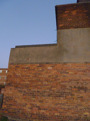
For all three modules I have decided to somehow intertwine research on the architecture of Wolverhampton into the projects (The logo form will be based around the architectural shapes for Branding in Context, that logo will then affect the animation for Applied New Media Design and my problem/solution will be based around the desolation of buildings and the editorial forms will also be affected by building structures in Applied Editorial Design). So here are my images of the types of forms I am basing my ideas/designs around...
Sunday, 16 October 2011
APPLIED NEW MEDIA DESIGN : FINAL LOGO ANIMATION DESIGN
Here is the final design for my logo animation, featuring the rebranded Wolverhampton logo I have created and how I want the final ident to look.
Thursday, 13 October 2011
APPLIED NEW MEDIA DESIGN : ANIMATION TESTERS
I had already posted about my "W" logo designs, and it was important while considering my design process that I had to remember the Applied New Media Design module. Considering the fact the animation has to be visually interesting, I wanted to experiment with how I could "fold" up my logo (by creating it physically in paper form) and then begin to translate that to the screen.
BRANDING IN CONTEXT : WOLVERHAMPTON LOGO DESIGNS
Here is a sheet I have selected from my initial degins for my "W" icon, to accompany the type of "Wolverhampton" and a strapline, that together will form my re-branded logo.
The "W" below is the the icon I believe is strongest visually (mainly in its simplicity and I feel it holds the qualities I wanted to incorporate - architectural structure, inspired by the buildings of Wolverhampton). I also feel it will cross over well into the Applied New Media Design module, as I feel the structure of the icon will lend well to an animation (such as being animated to appear as if it is paper unfolding).
Wednesday, 5 October 2011
RE-BRANDING MELBOURNE
I found this video ident from a 2009 campaign where the logo and visual brand of Melbourne was redesigned and re-branded. It feels extremely relevant to the "branding in context" AND "applied new media" modules, incorporating logo/brand design with animated logo details. I believe this video shows a very successful design, feeling sleek, uncluttered and relevant to today's visual landscape. I hope to incorporate the same fundamental values in my own work.
Sunday, 2 October 2011
LINK : BRANDS NEED TO BECOME 'FRIENDS' WITH THEIR CUSTOMERS
On the telegraph website there is a new article detailing facebook's new plans for it's website and brand (which is still slowly taking over the world, one computer screen at a time...). The writer, Emma Barnett, talks about advertisers taking a more focused look at people's movements on their facebook page to 'get to know them more', or, to advertise more specifically and individually to each person. She questions whether this is a healthy approach and also if other brands will take head from the global giant. On one hand the advertisements would be focused to the individual, relevant pieces or products and would be helpful for something they needed/wanted. But, on the other hand, it does have a hint of "big brother" about it...
What do you think?
FIRST POST
So, with this blog I'm hoping to tie together all the research, initial ideas and designs for my semester 1, year 2 modules: Branding In Context, Applied Editorial Design & Applied New Media Design.
The briefs outlined are based on the idea of "re-branding" Wolverhampton, much in the vein of the cities of New York or Barcelona's city re-branding.
I'm hoping that this blog aids me in showing the journey my work will take throughout the design process.
Enjoy :)
The briefs outlined are based on the idea of "re-branding" Wolverhampton, much in the vein of the cities of New York or Barcelona's city re-branding.
I'm hoping that this blog aids me in showing the journey my work will take throughout the design process.
Enjoy :)
Subscribe to:
Comments (Atom)


